See an updated version of Best UX Practices in 2024 here.
Dealer locator software has significantly evolved in sophistication over the last 5-10 years. Historically, a relatively stagnant feature set dominated the user experience. This includes a basic zip-code search with radius, results with names and phone numbers and not much else. The prevailing strategy was to effectively emulate a phone book or directory of dealers. The list-based approach has come and gone, and a new standard of practice for dealer locators has emerged.
Companies can have varying objectives when building a locator. This article will attempt to highlight some of the newer, less obvious features found in leading-edge locators.
A Philosophical Shift
This article outlines some of the top best practices for modern dealer locators. The features described here go beyond the basics of zip code search, and consider the locator as source of new and continuing business. Locators are now leveraged to generate leads, conversions and to reinforce brand at multiple customer touchpoints.
The idea of considering a locator as a source of new business is still relatively new in some industries. When customers first engage with a brand, the first experience can often begin with a dealer locator. For traditional locators, the brand managing the directory has little to no visibility into the customer journey at this stage. Not fully understanding the customer experience at this point is a well-established bad practice in traditional lead generation. Dealer locators have flown under the radar for years and viewed as an afterthought. We can hear this in the language our customers use sometimes, e.g. “we need a zip code search plugin” or a “map search widget”. We recognize this use of jargon as an indicator that the locator is an epilogue of a Website project.
When held in diminutive regard, locators yield proportional results. However; when customers embrace locators as conversion-focused, measurable lead generation platforms, the output can be equally transformative.
Best Practices in Lead Generation
Locators should initiate a continuum of customer engagement that seeks to capture and nurture a customer through the process of engaging with the brand. In a dealer locator, this can be through one or more dealers, a sales representative or the brand itself. Historically, dealer locators present a list of distance-based results and the customer must then proactively contact one or more dealers until they successfully engage. Brands tend to think of this process as generally successful. That impression is not supported by our observations. For customers leveraging our lead tracking, on average, customer inquiries via email are acknowledged by just over 60% of dealers. This figure is commonly shocking to our customers, though we understand it represents the norm.
To upset this status quo, the phone book user experience model of the locator has to shift to a series of well-tracked touchpoints. The initial inquiry should kick off a feedback loop which includes the following key components of what we refer to as Lead Optimization.
- Notifications of lead inquiries should be tracked and measured for response time
- Leads not acknowledged quickly enough should be automatically re-assigned to high-performing dealers or sales managers.
- Every lead inquiry should reach a customer service representative, whether that is direct or indirect within minutes and hours, not days.
- Highly responsive dealers should be rewarded by more prominent placement in the locator.
- Lower performing dealers can be corrected and trained or culled.
- The leads should be engaged for feedback on their experience through collection of a star-based review.
Measuring dealer performance in a manner that pushes high-performing dealers to the forefront creates a continuous improvement cycle that increases revenue, improves relationships with dealers and overall customer experience.
Best Practices in UX
The user experience in a locator should receive as much attention as any conversion-focused UX. The locator often represents the first impression and initial engagement with a brand. User experience in the initial presentation, the calls to action, mobile experience and lead capture are key to success.
Initial State
The initial state of a locator should present nearby results without requiring the user to perform a search of any kind. Ideally when reaching the locator, the customer should be presented with the brand’s preferred call to action above the fold. That call to action should be reinforced by social signals and include a bold display as shown below:
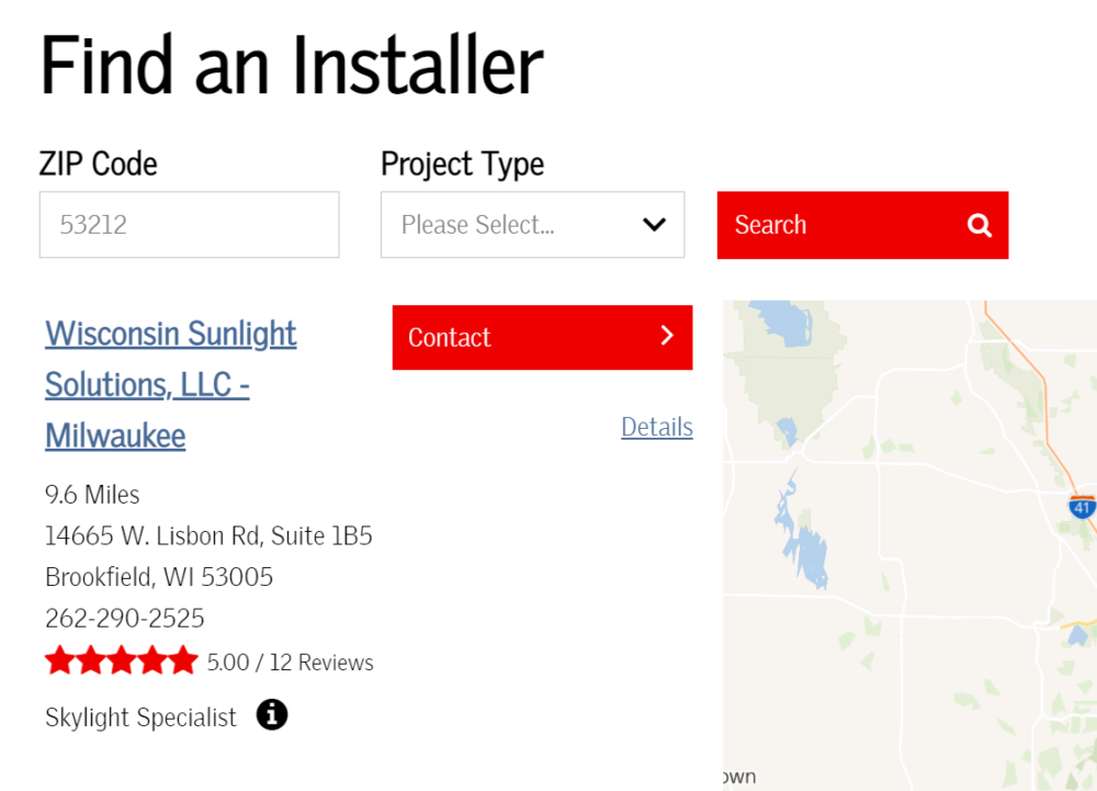
The initial state should show results relative to the user. As a user in the United States looking for results nearby, I should see the nearest 5 to 10 dealers that are relevant. Some brands see the locator as an opportunity to showcase how many dealers they have across the country. A national display in this scenario is not reflective of the user’s objectives and should be avoided.
A global or country-level view should be avoided unless the user is physically outside the country they’re observing. A common mistake we see is blindly leveraging geolocation regardless of the user’s relative position to the location data. For example, when a visitor in the United States is viewing a locator in the United Kingdom, the system should not leverage the visitor location and instead display a country-wide view.
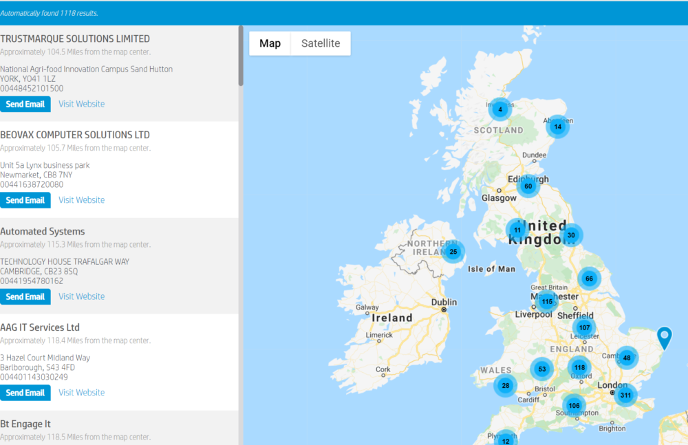
The examples above have shown how user location can be leveraged. There are two primary methods available on the Web today, IP geolocation and HTML5 geolocation. IP geolocation does not prompt the user for permission, and is accurate to the city or zip code level. HTML5 geolocation does prompt the user, but it is much more accurate. In dealer locators, we do not commonly recommend HTML5 geolocation because of the user prompt, and the improved accuracy usually does not affect the results.
User location should be leveraged, but also affirmed to the user that it is in play. The locator should reflect the user’s detected location visually. This helps the user visually and spatially orient themselves and is key to usability.

Search
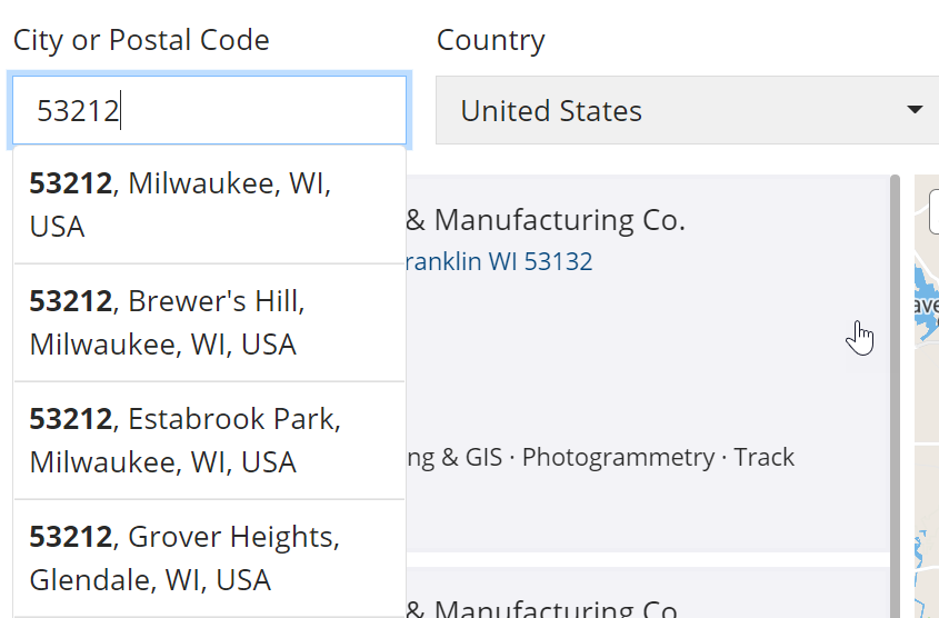
Search should accept nearly any geographic term intelligently. The search input should accept zip codes, states, street addresses and so forth. The search should also support a suggestion feature to affirm and automatically complete the user’s search.
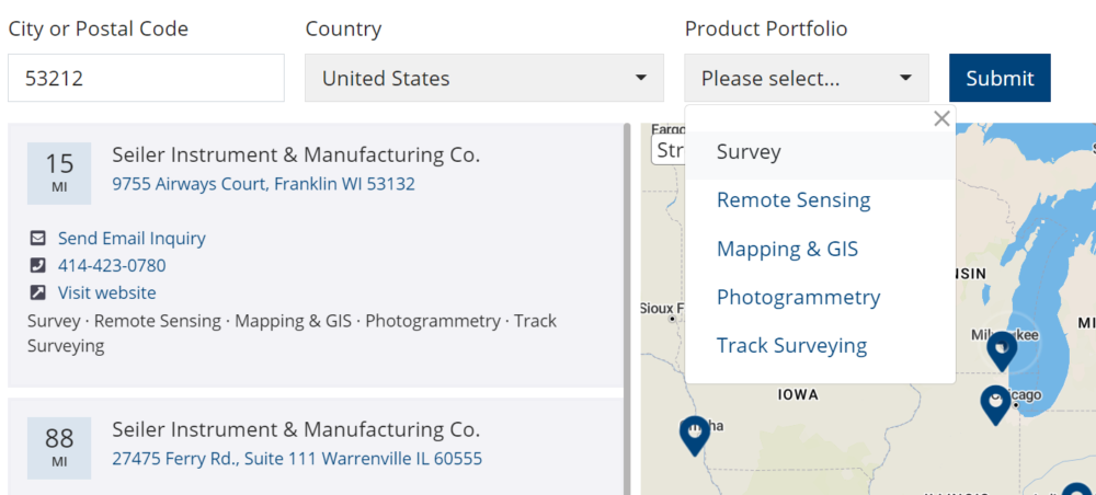
Radius drop-down lists represent an outdated UX paradigm and should be avoided. Users are not commonly asking themselves “Is there a dealer within 5 miles”, they are asking “Who is the best dealer for my needs”. The locator should address the latter, and focus on delivering high-performing results that are relevant. In dealer locators, distance can often be a secondary consideration. In B2B and some consumer markets the actual distance is commonly not a deciding factor for the customer. For example, the customer may not care that the best installer for a home multimedia system is 30 miles away if they never have to make the trip themselves.
Products and Services should be a search option when those offerings vary by dealer. The products should use customer-friendly verbiage and avoid industry jargon. Users should be able to add products and services as an additional factor to the initial state.
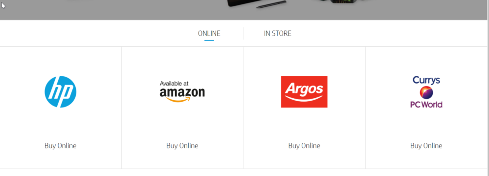
Buy online should be an integrated aspect of search. Locators are commonly presented under the label of “Where to Buy”. It is important to answer that question completely. Online sales can often be a critical channel alongside in-store and indirect sales. Online results can be displayed in a tab as shown, or inline as part of the online offerings of local dealers.
Results
Results should be designed around a primary call to action (CTA). The primary call to action should be displayed as a bold button with a clear message. The bolder the CTA, the more often the user will choose that method of engagement.

Results should ordered by relevance to the user, including distance, priority, product portfolio representation and more. A simple distance-based locator does not completely answer the question of relevance. The locator should consider all available factors in ordering and prioritization when presenting results. This can be internal factors, like a dealer score or annual sales or externally visible factors like distance, products or reviews.
Results should be comprehensive, but not overwhelming. Locators can contain a lot of information regarding each dealer. The initial results card should contain primary calls to action, essential contact information and little else. Details can be relegated to a secondary pane where long-form copy, large product lists, menus and services can be displayed.
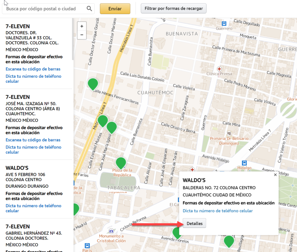
Phone numbers should support click-to-call. Each phone number should include a trackable, clickable phone number. Tracking is essential in all aspects of the locator, but is often overlooked in clickable phone numbers due to how some phones automatically create those links.
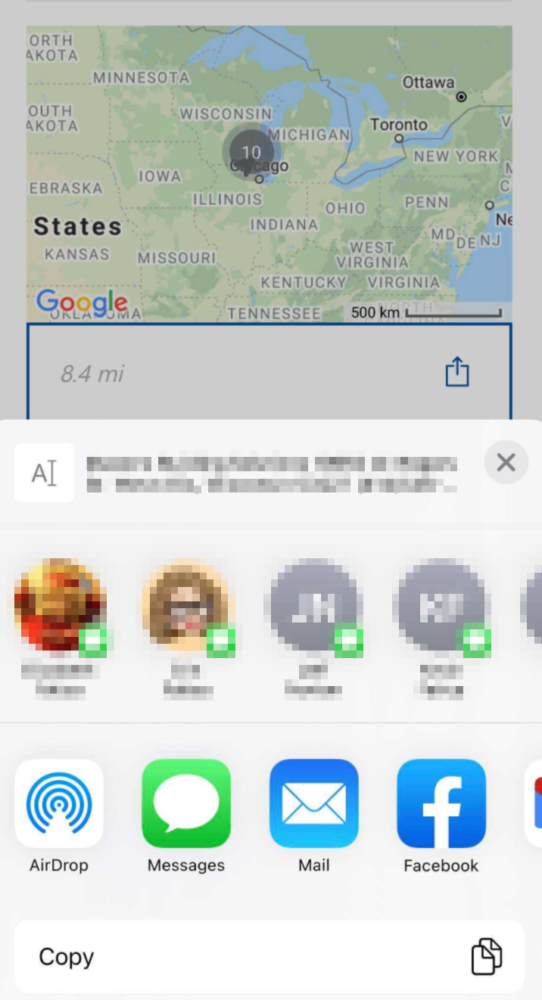
Results should be readily shareable and designed mobile-first. Locators on the desktop are often visited during trip planning. Locators on mobile are often used when the trip is already underway. When the user wants to send the results from the desktop, to a phone, social media, email and so forth a quick, intuitive UI should display all related functions.
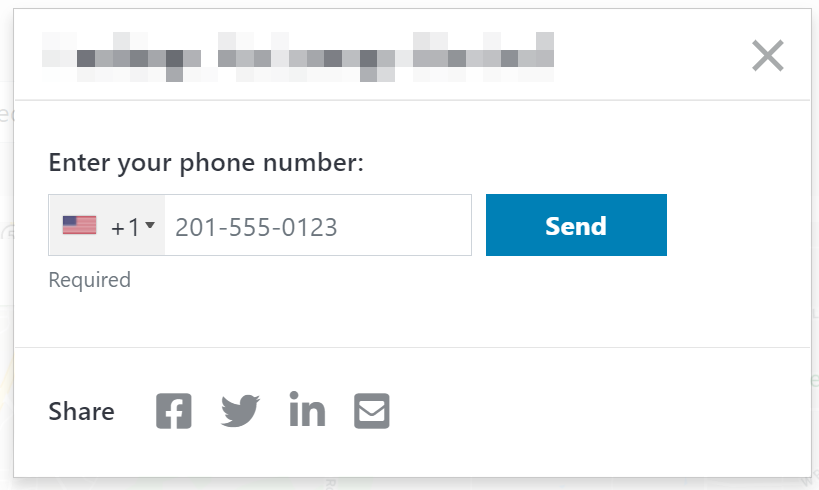
This can be as simple as a clipboard copy control:
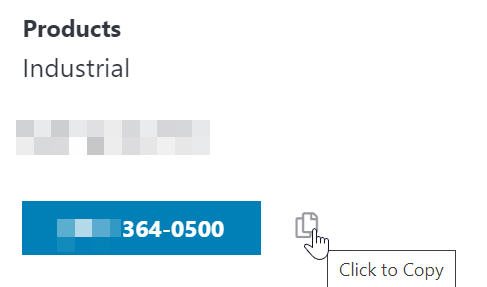
The locator should allow users to share via the channels and methods preferable and familiar to the user, especially on mobile devices as shown below:
Integrations & Deep Linking
The locator should tie into other aspects of the Web site. For example, in eCommerce a product detail page might include a Where to Buy button that takes users directly to the locator, pre-filtered to include the product category or SKU from the product detail page.
Blogs and other related pages can also deep link into the locator with product categories, geographies or other options to ensure the user has a fluid experience directly into the locator without having to re-select their topic of interest.
Accessibility
Locators should be accessible to all users of all abilities, including support for at least WCAG level AA. Federal section 508 standards are also essential if any federal funding is involved.
Content Management
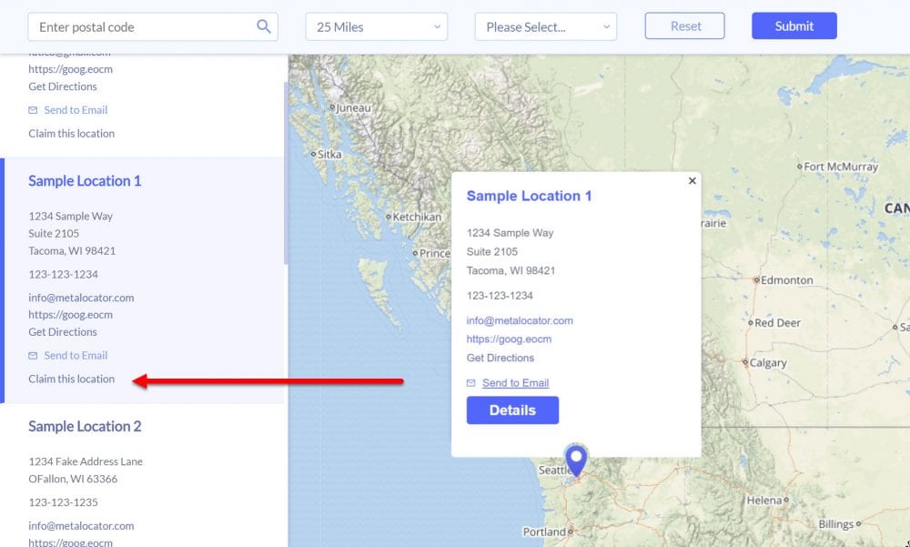
This article has focused on innovations and best practice in end-user experience, less the management of locations and data. However, one aspect of UX that overlaps with content management is front-end data collection. For subscribers to our Crowdsourcing addon, dealers themselves can identify, suggest and make corrections directly to data in the locator. This allows dealers a familiar workflow of claiming a location, making changes and ultimately improving the data in the locator. Accurate dealer data is essential and frankly paramount to user experience.
Summary
This article attempts to summarize what we consider to be essential user-facing best practices that might not be immediately obvious to those readers exploring a new locator project in 2021. There are many more features and best practices to explore in other areas including administration and content management, lead routing, and ETL. Hopefully this overview provides a great starting point to building an industry leading dealer locator.
