This topic is always great to revisit each year, especially when looking back at how UX as a whole and locator software has changed since we got started, over 17 years ago…
Before you click back, this is *not* one of those recipe blogs that waxes historical about the peach cobbler that “Mom used to make”. Its just that B2B software, and websites in general used to be so bad. And I absolutely love the revolution in UX that has taken off, especially in the past 5 years. Now-a-days, when you see a poor user-experience, it stands out unquestionably as apathy, lack of investment and poor attention to detail, which – one can only assume – must reflect the culture and the product.
To appreciate the role of a locator in the customer experience, or CX as the kids say, you first have to fully understand a typical customer journey. What is typical? Well, of course, it varies from industry to industry, customer to customer, but for the purposes of our core audience, it is commonly a human seeking to identify a business contact that can fulfill our customer’s brand promise. In real terms: a dealer who can install your skylight, a doctor that can fix your neurological tremor or a salesperson who understands what you’re trying to buy.
In those examples, our customer is the skylight manufacturer, the medical device manufacturer or, well… you get it.
The dealers, doctors and salespersons are often what we call the indirect channel, meaning they don’t work directly for the manufacturer. They’re an independent provider who doesn’t answer to our customer, but they are certainly a critical link in the chain of moving the manufacturer’s product.
This sets up a unique dynamic where there is a referral happening – a critical hand-off – where, oftentimes, our customer, the owner of the locator, sometimes has only a precursory understanding of the availability, reliability and even existence of the referral target.
We specialize in ensuring that referral is successful and transparent. We do that in a continuum of touchpoints called Lead Optimization, but we’re not here to talk pipelines, were talking UX. So why bring it up at all?
I’m making the argument that the Dealer Locator, Installer Locator, FAD (Find a Doctor), whatever is akin to the much-UX-belabored eCommerce checkout process. If direct channels are shaving pixels, milliseconds and drop-shadow-opacity-fine-tuning the add-to-cart UX, then the indirect channel, e.g. the locator, needs the same attention since, at the end of the day, both these features are driving sales for the manufacturer.
Phew! O.k. Rant complete.
Now let’s get down to what’s new and still interesting in UX for locators in 2024.
Use a sane results count
When user’s arrive at your locator, they should be greeted by a rational number of automatically-detected, relevant, actionable results. Don’t be that customer that wants to flex their global distribution of 6000 results. I’m here in Milwaukee. Good for you, but I don’t care that you ship laptops to Malaysia. It’s not relevant to me as an end user. Show me 5 or 10 of your best…we’ll get into that more, later.
Help users compare results
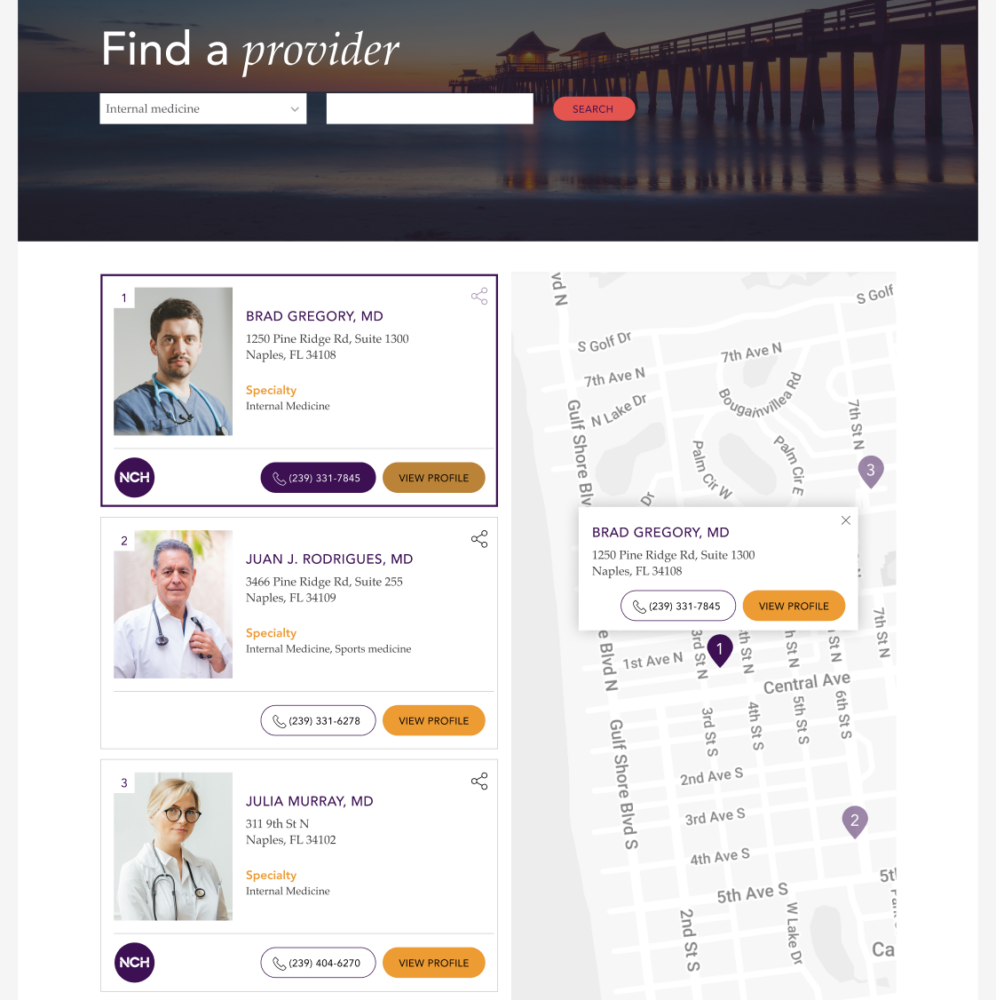
You’re presumably showing a list of results, right? You should display the information the user needs to compare one result to another. Ideally, I should be able to make my decision without any additional clicking. If distance is a factor, show it, but if the user won’t use the distance as a deciding factor, remove it. Show any certifications, reviews or product lines that help the user understand who this result is, where they are, what they do and how well they do it.
Integrate your brand throughout the experience
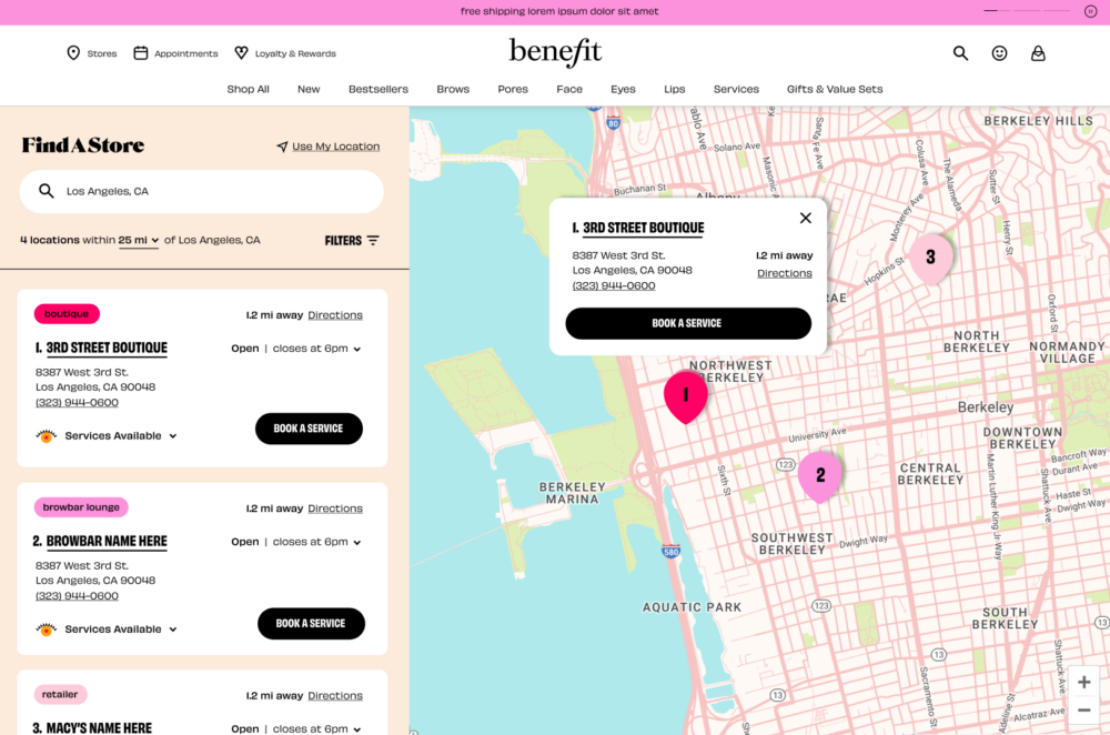
If you can easily spot that the locator is a “plugin” then you’re “doin’ it wrong”. The customer should easily move into and through the locator with consistent button treatment, fonts, colors, everything. This brand integration communicates a professionalism, attention to detail and all the bells and whistles that you (hopefully) bring to your core product.
Use intelligent, predictive search
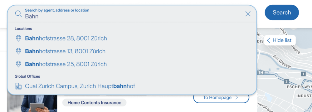
Stop searching like its 1999. Things that irk me these days include search algorithms that were last polished when Prince was talking Purple Rain. Your one search input should support zip codes, city names, country names, addresses and even keywords and product names! Google has made it harder to build a search input that meets the average user’s expectations. Of course, we don’t all have 5 billion laying around to invest in locator search, but MetaLocator has certainly invested plenty of time and other numbers that end with “illion” in creating a powerful and simple locator search.
Automatic suggestions should match keywords, location names and product names. They should be biased to the user’s location and the data in the locator. They should do this while also supporting global search for far-away places, if needed.
Sort by more than distance
Ask yourself: “Do I honestly care how far away this roofing contractor is?”. To be fair, sometimes, the answer is yes but there are a lot of applications where our customers might be thinking in terms of distance solely based on muscle memory. In the first point above, I mentioned showing your best first. This can give some customers nightmarish visions of legions of contractors with torches and pitchforks storming the halls with calls of unfair practices and preferential treatment.
Dramatics aside, we can measure the contractors response time to a customer inquiry, we can capture reviews, we can capture profile updates, we can verify contact details so we know when we have accurate data. In that context, why would we not leverage that data in the results ordering? In deference to the appearance of fairness, you don’t always need to show the user every sorting factor in play.
Show me the resource that responds the fastest, has the best reviews and ultimately provides the highest quality customer experience first. They work hard for your brand, why not promote them? The added benefit is that it creates a self-healing locator, where your partners with the best CX move up in the locator ranks while giving you the opportunity to fix the issues with those falling behind. Everybody wins.
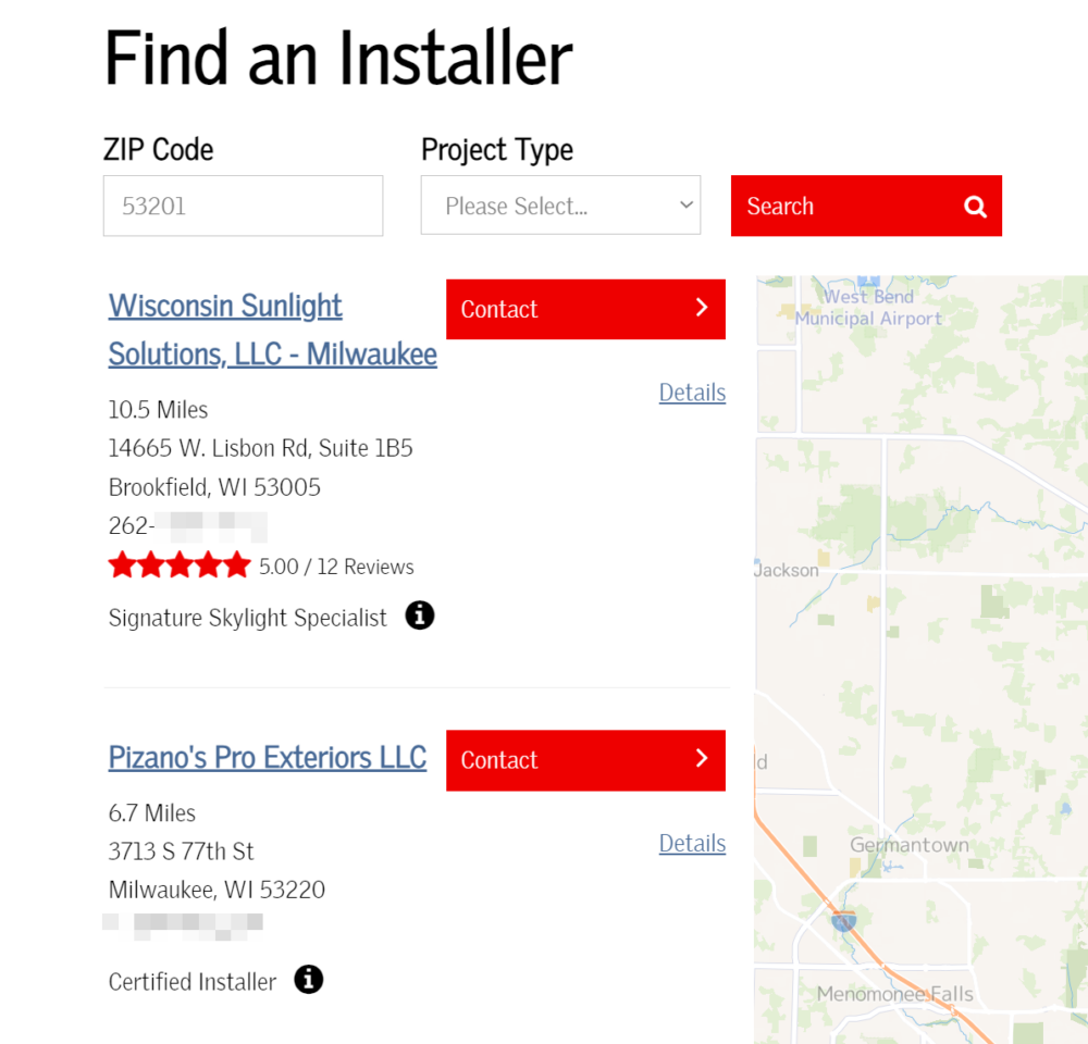
Pick one 👏 trackable 👏 primary 👏 call to action
If you give users the ability to call, they’ll call. If you give them direct access to your partner’s email, they’ll use it. In both of these cases, you’ve accomplished your mission of connecting a prospect to a resource, but you’ve lost visibility of the outcome.
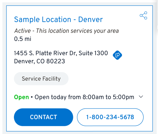
Tell me, what action draws your attention most in the results card below?
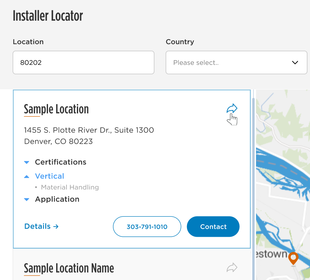
Of course, it’s Contact. Clicking Contact in this example generates a lead that is trackable, measurable and attributable. Your partners will appreciate this and your network will get healthier as a whole.
Don’t scatter your clicks to the wind by providing a lot of competing calls to action.
Summary
I could go on, right? We didn’t revisit past rants about poor practices, radius drop-downs (shudder) or even dive into the finer points of button design, positioning and padding, but those aren’t the points we find ourselves making over and over. This article touches on the UX best practices we’re advocating for here in mid 2024. If you have any you love, or hate, drop us a line on social media.
Thanks for reading and happy locating!


